We have a secret. And we’ve been keeping it from you for months. As we embark on our 2015/16 season, BalletMet is moving forward with a new look!
As with everything we do, we believe that the best product is created with a mix of the old and the new. We are – and will remain – the BalletMet that you know and love. We’ve simply added an extra splash of elegance, inspired by our incredible dancers.
LOGO
After more than a decade with the same logo, we decided that it was time for an upgraded and enhanced visual identity that matched the quality of our artistic product. Months and months of hard work have culminated with this moment and we are so excited to finally share our new logo with you!
We want to give a shout out to Jeff and Mike at Jump Creative who created this new look for us and will be continuing with BalletMet during the 2015/16 season.
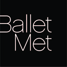
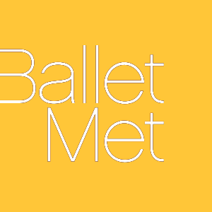
COLOR
The long, thin lines that create the BalletMet name evoke the delicate strength and beauty of our dancers and the art form that we love. Although the logo above is shown in black, we don’t have one specific color palette for the logo. Its color will change depending on how and where it’s being used.
PHOTOGRAPHY
In addition to being color non-specific, we also have the ability to invert the logo and use our gorgeous photography as the base color. This gives us even more flexibility and allows us to maximize the impact of our photography by integrating the logo directly into photos.
VISION
This new visual approach reflects Artistic Director Edwaard Liang’s vision to tour BalletMet internationally and take the amazing artwork we create here in Columbus to cities around the world. We are ready to propel BalletMet – and the entire Columbus arts community – onto the international stage and this new, sophisticated look is going to help us get there.
We’re on the move. Stay tuned and see just how far we go.
#BalletMetMoves
#BalletMetNewLook